Mingrui Fu, Yiu Chun Brian Ho, Xiangruixue Leng, Yiheng Li, and me.
Unit
University of Toronto
About Foodnote
Foodnote is a mobile app designed to simplify meal decisions for post-secondary students. Through background research and qualitative studies, we identified key barriers such as limited time, cooking skills, and budget, as well as influencing factors like nutritional needs, preferences, and mood. Foodnote addresses these by integrating customizable filters, allowing users to input parameters based on their needs and preferences to generate tailored meal suggestions.
Key Achievements
Presented project outcomes during playbacks to stakeholders, ensuring alignment and clear communication of design progress
Designed and wireframed the user interface for pending results pages, focusing on usability and visual appeal
Iterated on designs based on usability testing feedback, refining and improving user experience
Developed a comprehensive style guide, including color schemes, typography, and design elements through style tiles and mood boards
Conducted background research of 3 scources to define and refine research questions, aligning them with project goals
Created interview criteria and interviewed two participants, representing 20% of the total participants, to gather qualitative insights
STAGE 1: Problem Discovery
As a graduate student, with many peers living away from their parents, we share similarities in striking balance between heavy study and self-cooking, especially when have to decide what to cook.
Given curiosity whether most of the post-secondary students have similar struggles, literature review was conducted as the first step to deep into the problem and formulate solution to it.
STAGE 2: Qualitative User Research - Interview
"Cooking at home is generally cheaper, you know, especially for students on budgets. And also, I feel cooking at home allows me to control our ingredients." expressed Participant URL. from user interview
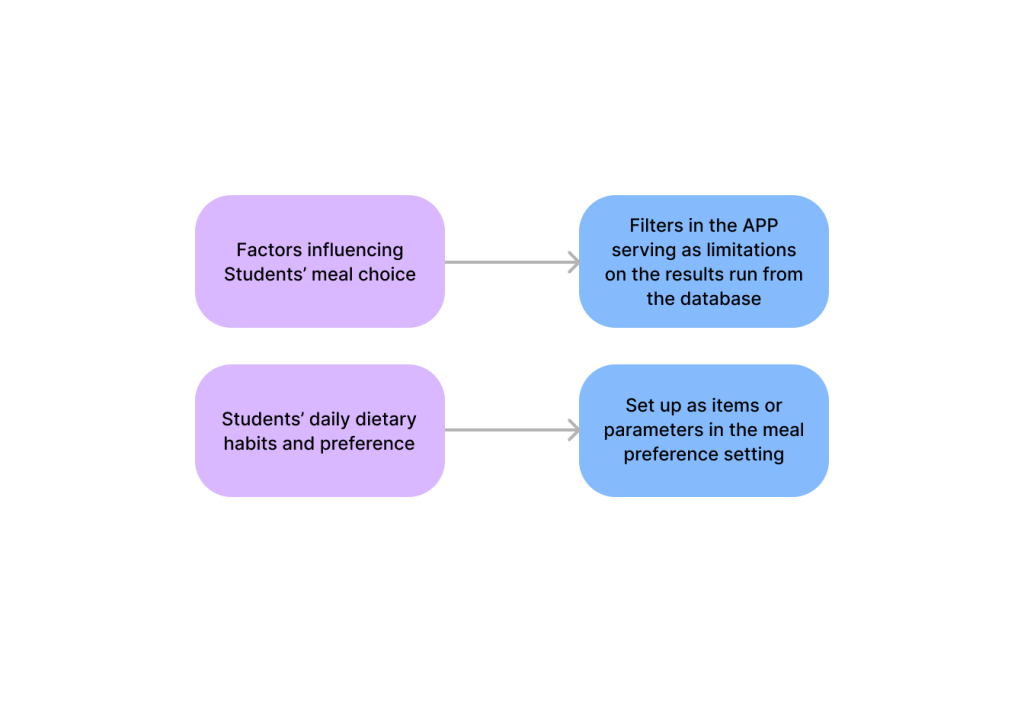
Through user interviews, we validated findings from prior literature and research, transformed the data into codes, organized them into affinity diagrams, and identified key factors influencing students’ meal decisions:
Goal: validate and receive insights first-hand from student peers in real environment
Format: semi-structured interview with prewritten interview questions and scripts; open to extended questions during the interview
Participant: 10 participants in total, consisting of students in different grades, programs in the post-secondary institutes in Toronto, ON, Canada
Through user interviews, we validated findings from prior literature and research, transformed the data into codes, organized them into an affinity diagram, and identified key factors influencing students’ meal decisions:
1. Available Time 2. Cooking Skills 3. Nutritional Needs (calories, dietary restrictions) 4. Preferred Taste or Moods
STAGE 3: DEFINE GOALS
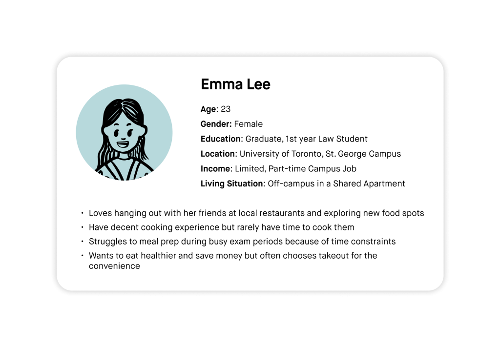
Post-secondary students often struggle with deciding what to eat and maintaining a healthy diet, primarily due to constraints such as limited time, tight budgets, and insufficient cooking skills. According to previous research, no existing solution fully addresses these challenges. We built upon our research findings by utilizing brainstorming techniques and a two-axis diagram to narrow down our insights into feasible design solutions. This process included defining a targeted user persona and mapping out a detailed user journey.
How do these findings translate into real-world applications?
We distilled two key insights from the affinity diagram and integrated them as core design elements in the Foodnote mobile app.
realization-from-insights-to-features
Doing brainstorming, me, the one wearing the white skirt
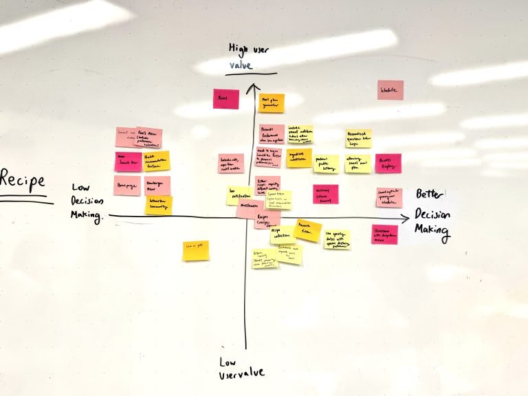
Two Aix Graph:
X-axis: Better Decision-Making / Y-axis: User Value
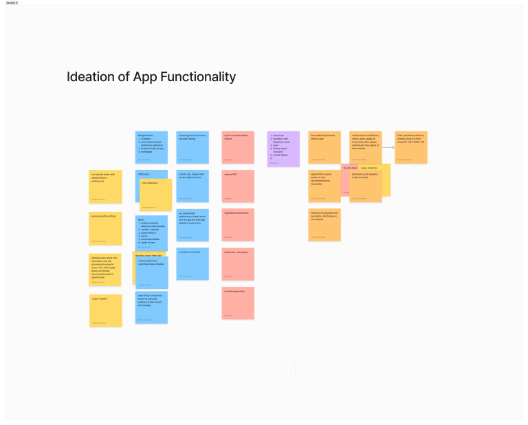
Through affinity diagram, ideated the functionality of the APP
STAGE4: DEVELOP
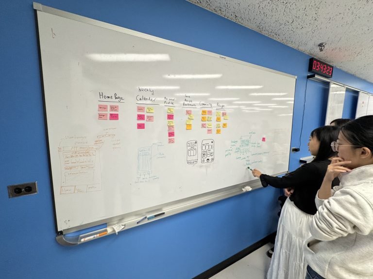
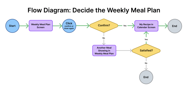
Crafted user flow
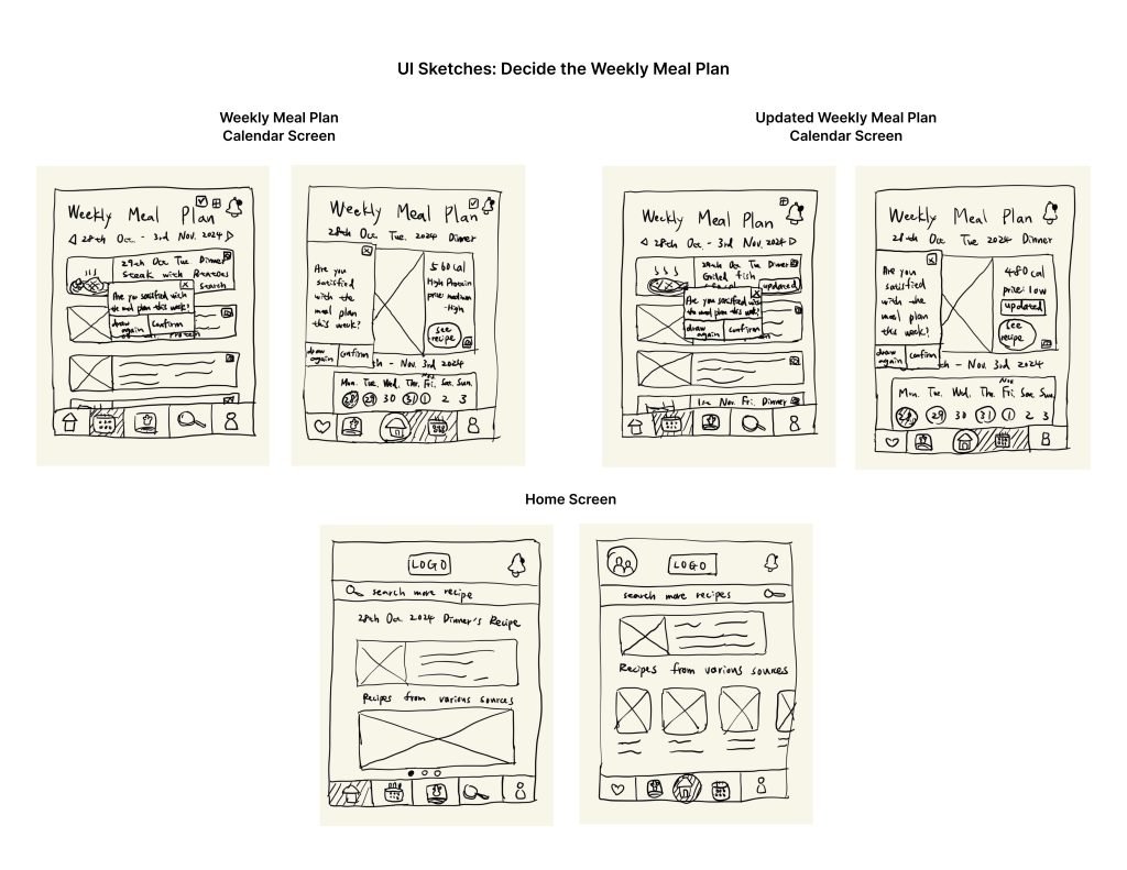
Visualized various ideas using wireframes
Generated prototypes via Figma to test and showcase the detailed interactions via usability
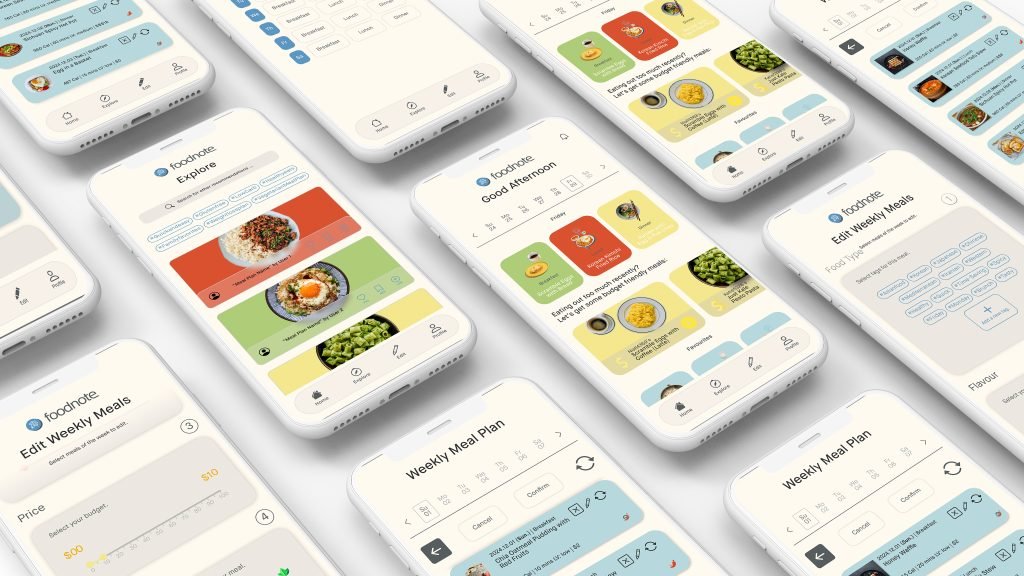
Wireframe Drafts by me
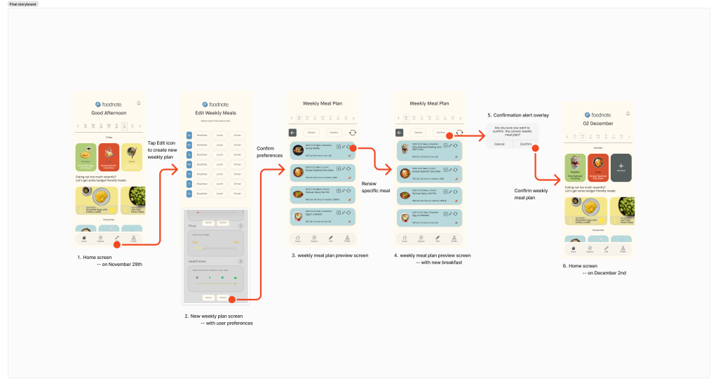
The Happy Path and final storyboard of Foodnote
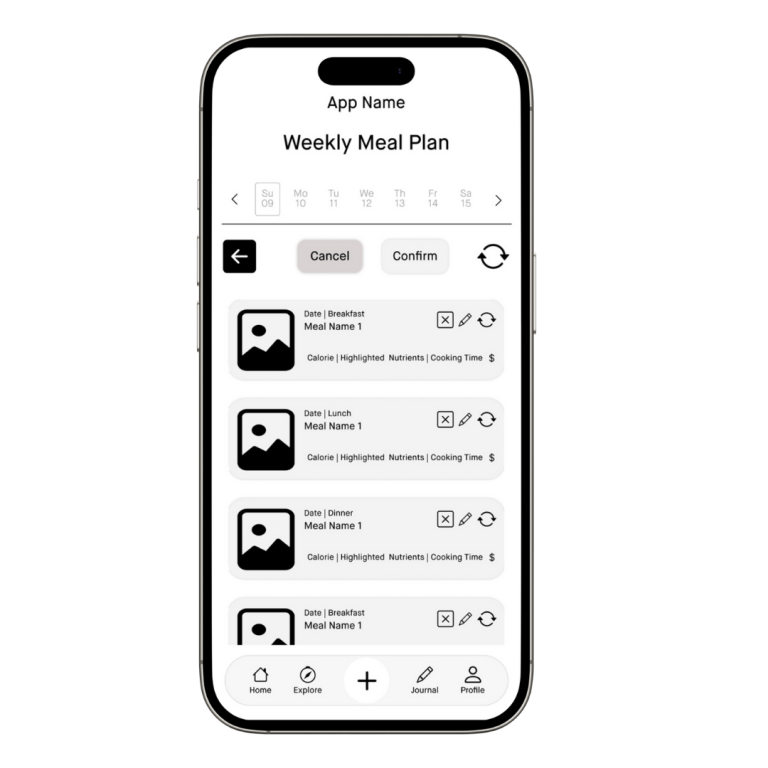
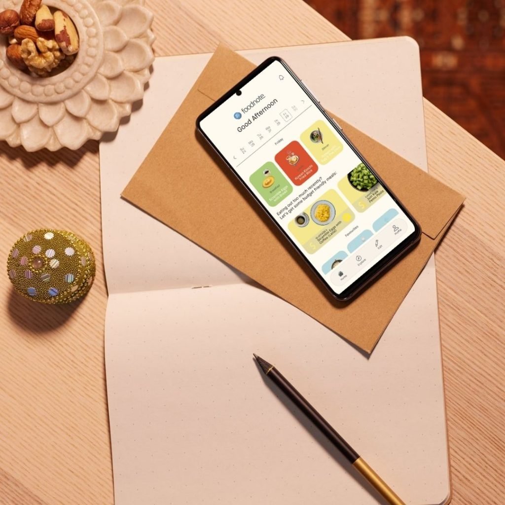
Meal Pending Page Wireframe designed by me
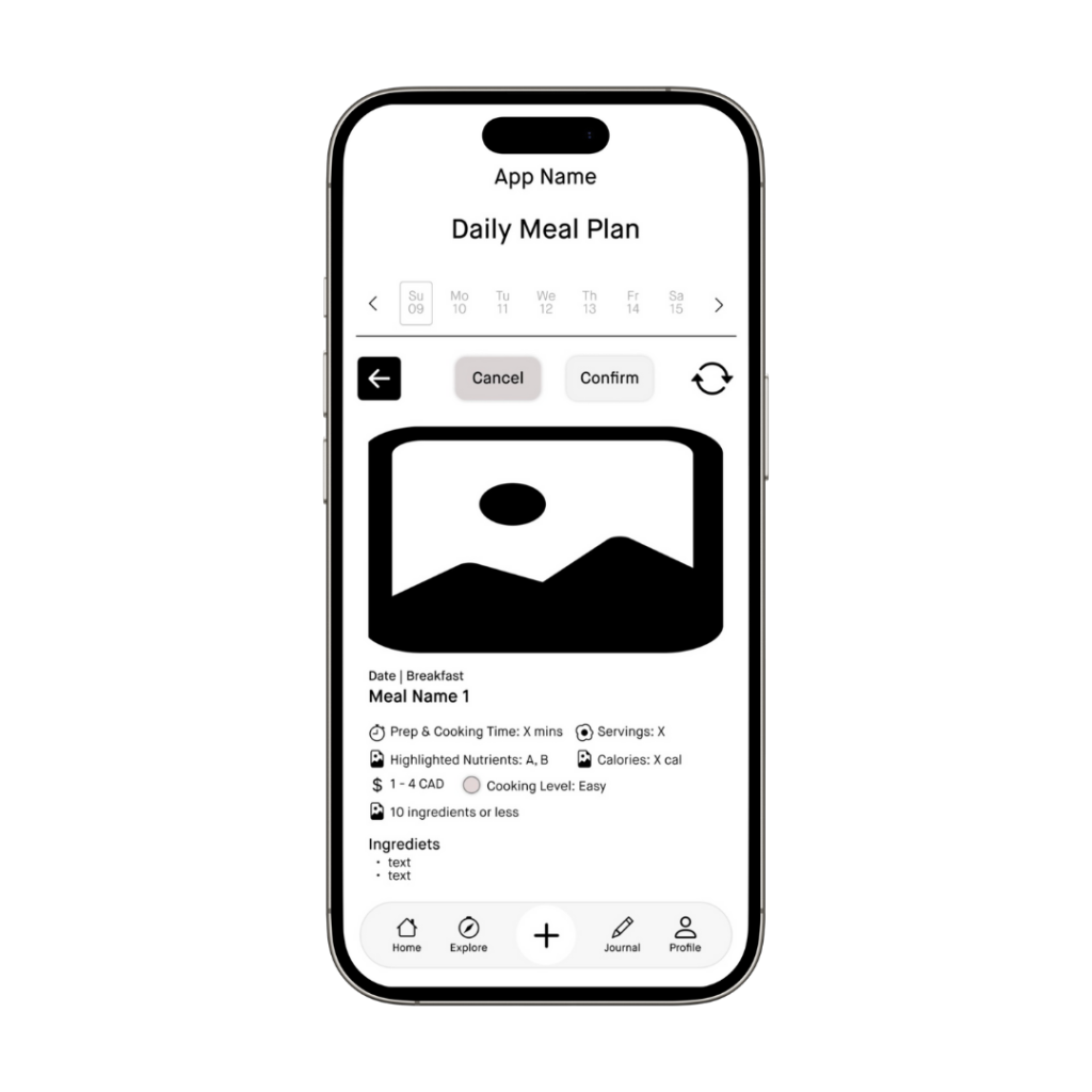
Recipe Detail Page Wireframe designed by me
STAGE 5: DELIVER
Iterated the designs based on feedback
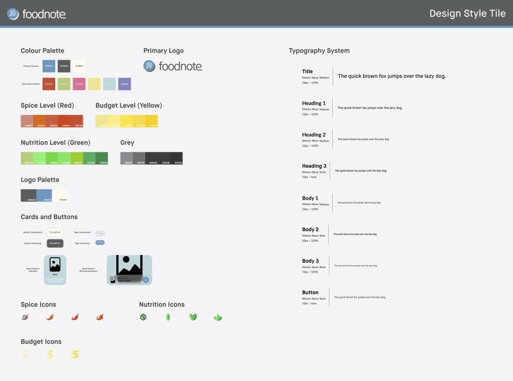
Created UI mockups and a style tile using a mood board for visual inspiration and consistency
Circle back and refine:
We conducted a total of 6 rounds of usability testing with peers and industry experts. Below are their feedback and our corresponding revisions.
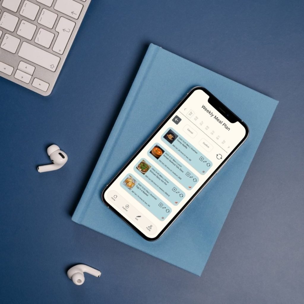
Goal: The aim is for users to intuitively understand the purpose of the app and successfully complete the “happy path” to set up the weekly meal plan for the following week.
Format: Testers will use the prototype we provided on our mobile phones to complete the task.
Participants: 6 participants in total, consisting of 5 peers and 1 industry expert.
Selected Findings and Corresponding Revisions:
Streamlined Meal Planning
Clear Labels and Icons
Effective “Explore” Feature with transparent recipe sourcing
Simplified “Journal” Feature
Remove the unclear “plus” icon on the homepage and replace it with “edit” icon to guide users in setting up their weekly meal plan.
Enhance design accessibility by replacing the unclear fire icon with a chili icon for ‘spicy’ dishes.
Introduce filters for the search function to improve the user experience, helping users find the recipes they want more efficiently
Relocate the “favorite” and “bookmark” features to the homepage, displaying related dish names as personalized recommendations
Style Tile of Foodnote
Reflection and Conclusion
Conclusion
As a course project, it is challenging to fully evaluate the impact this app could have. Only after its formal launch and multiple iterations based on real user feedback can the solution be continuously refined and improved.
Future Suggested Points of Improvement and What I Have Learned
If time permits, conduct an additional round of usability testing after completing the UI mockups. This would allow for further iterations in the product lifecycle, making the design more user-centered.
If resources allow, involve more participants in user research and usability testing to ensure that design solutions are driven by reliable, data-informed insights.
Systematize details and workflows by aligning all team members with established standards or principles in the design system. Document these standards in technical guidelines or institutional resources to reduce engineering workload and lower overall project costs.
Monetize the app by partnering with recipe providers to generate ad revenue and increase their recipe visibility on Foodie. Research indicates that social media and ads strongly influence students’ motivation to cook specific meals, making this strategy impactful.
My most valuable contribution was encoding interview scripts into actionable insights to guide design decisions. While rewarding, it was challenging to translate coded data into specific design elements. Expert feedback highlighted the importance of strengthening this connection. Through collaboration with teammates, I also gained new skills, such as advanced Figma techniques, particularly for interactive components. Their support in troubleshooting significantly enhanced the quality of our prototypes.
Yummy Tableware offers edible, eco-friendly alternatives to reduce disposable tableware use, made from bamboo for environmental sustainability. Customizable and nutritious, it can be consumed or decomposed after use, saving time and the environment.